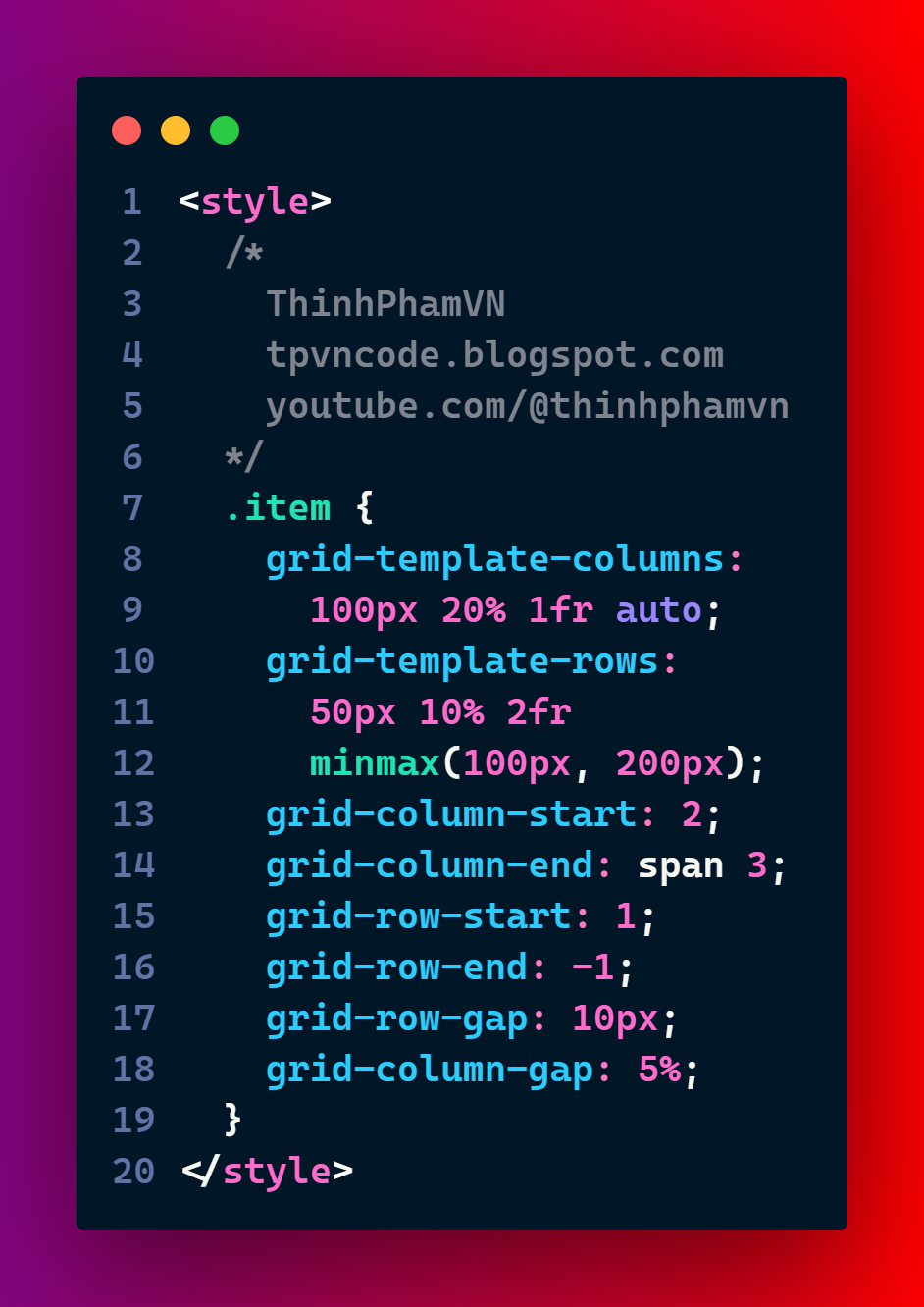
CSS Grid is a two-dimensional layout system used to build website interfaces (FlexBox is a one-dimensional layout). In this article, we will learn about the properties: grid-template-columns, grid-template-rows, grid-column-start, grid-column-end, grid-row-start, grid-row-end, grid-row-gap, grid-column-gap
- grid-template-columns: This property defines the number and size of the columns in the grid. You can use different units such as pixels, percentages, fractions or keywords to specify the column sizes. For example,
will create four columns with different widths.
- grid-template-rows: This property defines the number and size of the rows in the grid. You can use the same units as for the columns to specify the row sizes. For example,
will create four rows with different heights.
- grid-column-start: This property specifies the starting line of a grid item in the horizontal direction. You can use a positive or negative integer to indicate the line number or a keyword to indicate the edge of the grid. For example,
will place the item on the second column line from the left.
- grid-column-end: This property specifies the ending line of a grid item in the horizontal direction. You can use the same values as for the grid-column-start property to indicate the line number or edge. For example,
will make the item span across three columns.
- grid-row-start: This property specifies the starting line of a grid item in the vertical direction. You can use the same values as for the grid-column-start property to indicate the line number or edge. For example,
will place the item on the first row line from the top.
- grid-row-end: This property specifies the ending line of a grid item in the vertical direction. You can use the same values as for the grid-column-end property to indicate the line number or edge. For example,
will make the item end at the last row line from the bottom.
- grid-row-gap: This property defines the size of the gap between rows in the grid. You can use any length unit to specify the gap size. For example,
will create a 10-pixel gap between rows.
- grid-column-gap: This property defines the size of the gap between columns in the grid. You can use any length unit to specify the gap size. For example,
will create a 5-percent gap between columns.


